GPT-Image2 Original Case Tutorial: 10 UI, Infographic, Resume, and Knowledge Content Generation Tests
A practical tutorial: Using 10 original case studies to test GPT-Image2's ability to generate UI, flowcharts, resumes, knowledge graphs, exam papers, and pseudo-screenshots, and summarizing a set of reusable prompt words.
GPT-Image2 is now currently being made available for large-scale use.
Today, I used GPT-IMAGE2 to conduct a set of original tests focused more on “practical-use content.”
Unlike simply pursuing atmosphere or a photographic feel, this set is more concerned with several harder questions that are also closer to real workflows:
- Whether text can be clearer
- Whether page structure can look more like real product design
- Whether infographics and knowledge diagrams can be made truly “understandable”
- Whether Chinese content, educational content, and document-style visuals can look more like finished products
This article fully organizes all 10 cases, and each case retains:
- The original prompt
- The output image
- What it is suitable to be used for
- How it can still be further optimized
If you are making tutorial websites, self-media covers, knowledge-based content, SaaS product visuals, or educational content diagrams, this set of cases will be more valuable for reference than “purely aesthetic images.”
What this set of cases is mainly testing
These 10 images are essentially testing 4 categories of GPT-IMAGE2 capabilities:
1. Text readability
Dashboards, blog homepages, resumes, cheat sheets, and product detail pages all contain a large amount of text. In the past, many image models would easily become blurry, incorrect, or messy once there was too much text. This set of cases is intentionally pushing on its text capability.
2. Structured layout
Flowcharts, resumes, exam papers, and classical Chinese explanations are essentially not about “drawing a beautiful image,” but about “arranging information logically.” This is much more difficult than simply generating an illustration.
3. Simulating real product interfaces
For images such as UI pages, Bilibili creator homepages, and e-commerce product detail pages, the biggest problem is when they only “look similar,” but on closer inspection lack real product logic. The focus here is whether it can produce a sense of hierarchy close to real webpage and app screenshots.
4. Visualizing knowledge-based content
RAG workflows, Transformer architectures, classical Chinese explanations, and math exam papers all essentially belong to the task of “turning knowledge into visual content.” This type of task is especially suitable for tutorial websites, course pages, social media image-text posts, and educational products.
A more stable way to write prompts
If you also want to make similar cases, I recommend writing prompts according to the following framework:
Content type to generate: what kind of finished product this is

Theme: what this image is meant to express

Core elements: which modules, cards, steps, titles, or fields must appear

Text requirements: which text must appear accurately in the image

Layout requirements: how these elements should be arranged

Style requirements: the overall visual direction, color, material, and atmosphere

Quality requirements:
- All text is sharp and readable
- Professional layout
- High detail
- No gibberish
- No watermark
Why is this way of writing more stable?
Because you are not only telling the model “what you want,” but treating it as a visual execution tool and clearly telling it:
- What kind of finished product this is
- What information the finished product should contain
- How the information should be arranged
- Which words must be correct
- What overall temperament the final image should have
Now let’s directly look at these 10 cases below.
Case 1: Modern SaaS Analytics Dashboard UI
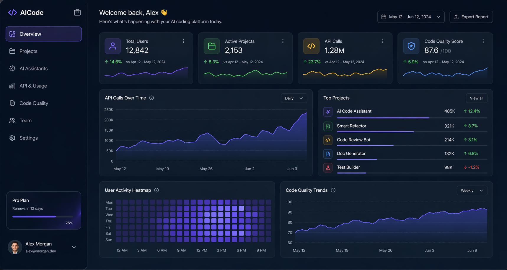
Prompt:
Modern SaaS analytics dashboard UI mockup (for an AI coding tool), dark mode, ultra clean and realistic, all text perfectly sharp: Total Users, Active Projects, API Calls, Code Quality Score, with charts and cards, glassmorphism, professional product design, 4K details
This is a very typical “high-value test question.”
Because it simultaneously requires the model to handle:
- A SaaS product-style layout
- Multiple data cards
- A chart area
- Multiple English UI copy elements
- Hierarchical relationships under dark mode
This type of image is most suitable for use in:
- Official website visuals for AI tools
- Product introduction pages
- Presentation covers
- “Fake product screenshots” in video covers
The key thing worth observing in this image is that it does not just create a “tech-feeling interface,” but gets relatively close to the visual language of a real B2B SaaS dashboard.
If you want to continue optimizing in the next round, you can add:
Keep the dashboard layout unchanged. Make the chart labels more precise, improve spacing consistency, and make the KPI cards look more enterprise and less conceptual.
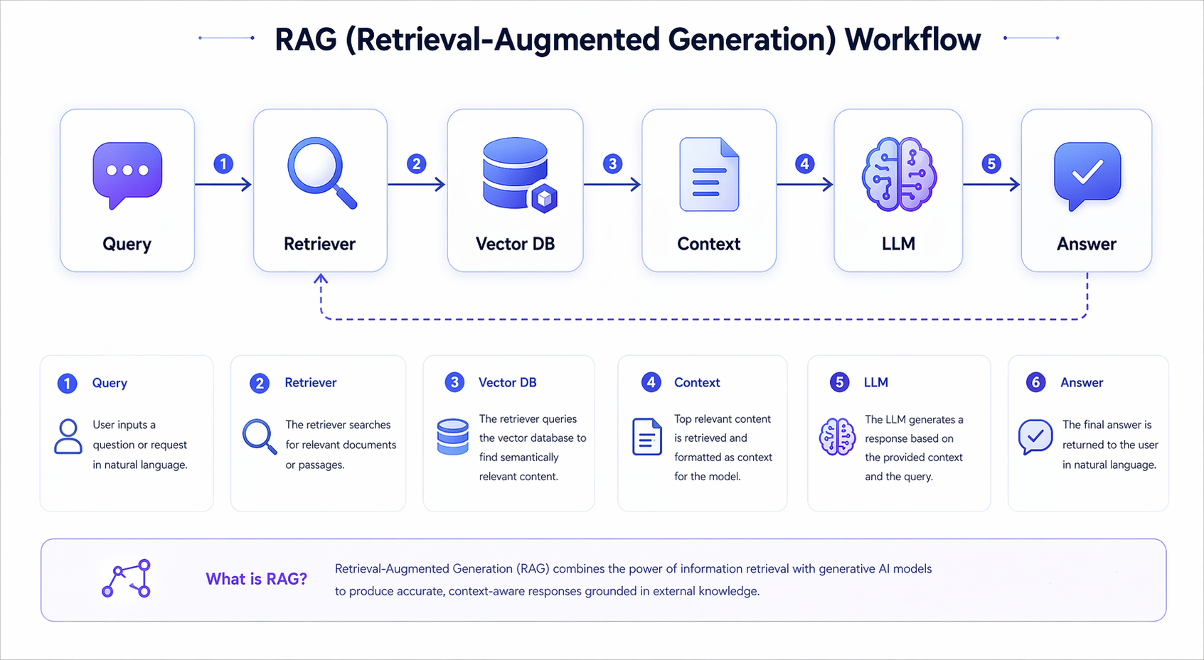
Case 2: RAG Workflow Diagram
Prompt:
A clear RAG (retrieval-augmented generation) workflow infographic, blue-purple tech theme, each step label must be sharp and readable: Query, Retriever, Vector DB, Context, LLM, Answer, with icons and flow arrows, professional educational infographic
What this case directly tests is the ability of GPT-IMAGE2 to create “technical educational diagrams.”
The difficulty of content like RAG is not in making it flashy, but in making sure that:
- The process nodes are complete
- The arrow relationships are clear
- The names of each module are readable
- The visual style is not too fancy, so as not to weaken information delivery
This type of image is very suitable for:
- Illustrations for AI tutorial articles
- Course handouts
- Science-popularization visuals for short videos
- Homepage illustrations for product documentation
If you want to continue iterating, I recommend writing the structural constraints even more rigidly, for example:
Use a left-to-right layout with six horizontal steps. Each node should be inside a rounded card with one icon above the label. Keep arrows simple and explicit.
This will usually make the flowchart more stable.
Case 3: One-Page Resume of a Chinese Software Engineer
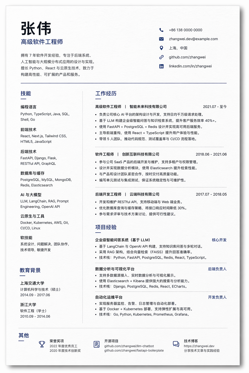
Prompt:
Professional one-page resume of a senior Chinese software engineer, clean modern layout, all section text perfectly sharp: Experience, Skills, Education, Projects. Use placeholder name '张伟', highlight Python, React, LLM, realistic paper texture with soft shadow, ATS-friendly typography
This is a very practical testing direction.
Because resume-type images require the model to simultaneously handle:
- Information density
- Page hierarchy
- Division of text blocks
- Realistic paper texture
- The credibility of looking like a “real document”
Typical use cases for this type of image include:
- Resume template covers
- Illustrations for job-hunting tutorials
- Promotional visuals for educational products
- Demonstrations of AI-generated document capability
In this case, the Chinese placeholder name 张伟 is very important, because it forces the model to handle the layout issue of Chinese and English fields coexisting.
If you want it to be closer to a real, submittable resume, you can further add:
Use a strict one-page A4 resume layout. Keep the typography ATS-friendly, avoid decorative icons, and make the content look realistic and editable.
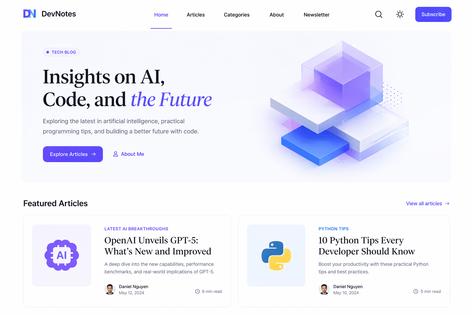
Case 4: Minimalist Personal Tech Blog Homepage
Prompt:
Minimal personal tech blog homepage UI, light mode with accent colors, navigation and article titles fully readable: 'Latest AI Breakthroughs', 'Python Tips', hero section with clear heading, elegant serif + sans-serif font combination
This is a case very suitable for testing “editorial feel” and the temperament of content websites.
What it tests is not complex functionality, but rather:
- Homepage information hierarchy
- Title readability
- Font temperament
- Control of whitespace on a light background
For tutorial websites, self-media blogs, and personal portfolios, this type of image can very easily be directly used as:
- Article header images
- Concept images for product homepages
- Theme style exploration images
One particularly useful part of this prompt is that it explicitly specifies two kinds of title text, and also specifies a “serif + sans-serif” combination. When generating content-oriented homepages, the model will often more easily move in the direction of a “magazine feel” or “editorial feel” because of this.
If you want it to look more like a real website, you can add:
Make it look like a real responsive editorial website homepage, not a design mockup. Keep navigation, metadata, and article cards coherent.
Case 5: Linux Common Commands Cheat Sheet
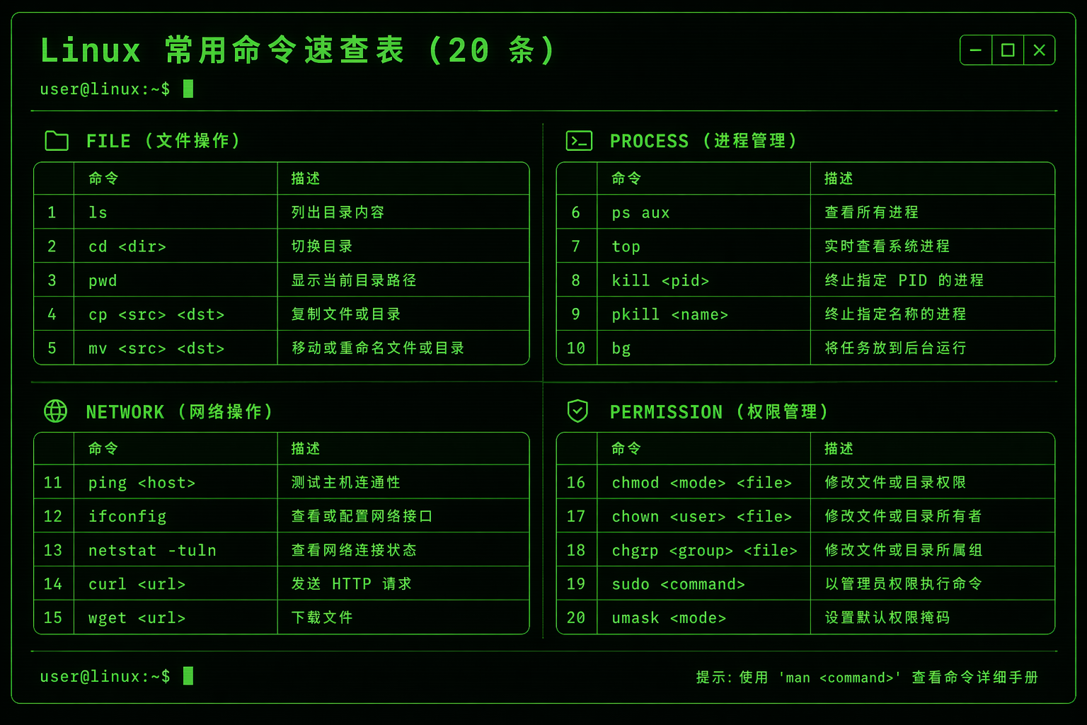
Prompt:
Linux common commands cheat sheet, terminal-style dark background with green text, all commands in perfect monospace font, grouped by category: File, Process, Network, Permission, accurately list the 20 most commonly used commands and short descriptions, retro-futuristic tech aesthetic, ultra sharp text
This is one of the most “hardcore” text tests in the whole set.
Because it not only requires:
- Many lines of text
- A monospace font
- Commands and descriptions appearing in pairs
- Clear grouping
It also requires it to look like a real terminal cheat sheet, rather than an abstract poster.
This type of image is suitable for:
- Programming tutorial covers
- Long infographic posts for community sharing
- Course materials pages
- Visuals for technical bloggers
The core lesson for this kind of task is:
Do not just say “generate a command table.” You must clearly specify:
- The group names
- The number of entries
- The structure of each line of text
- The use of a monospace font
If you want higher stability, in the next round you can change it to:
Create a poster-style cheat sheet with exactly four columns: File, Process, Network, Permission. Each column contains 5 commands with one-line descriptions in monospace text.
Case 6: Mechanical Keyboard E-commerce Product Detail Page
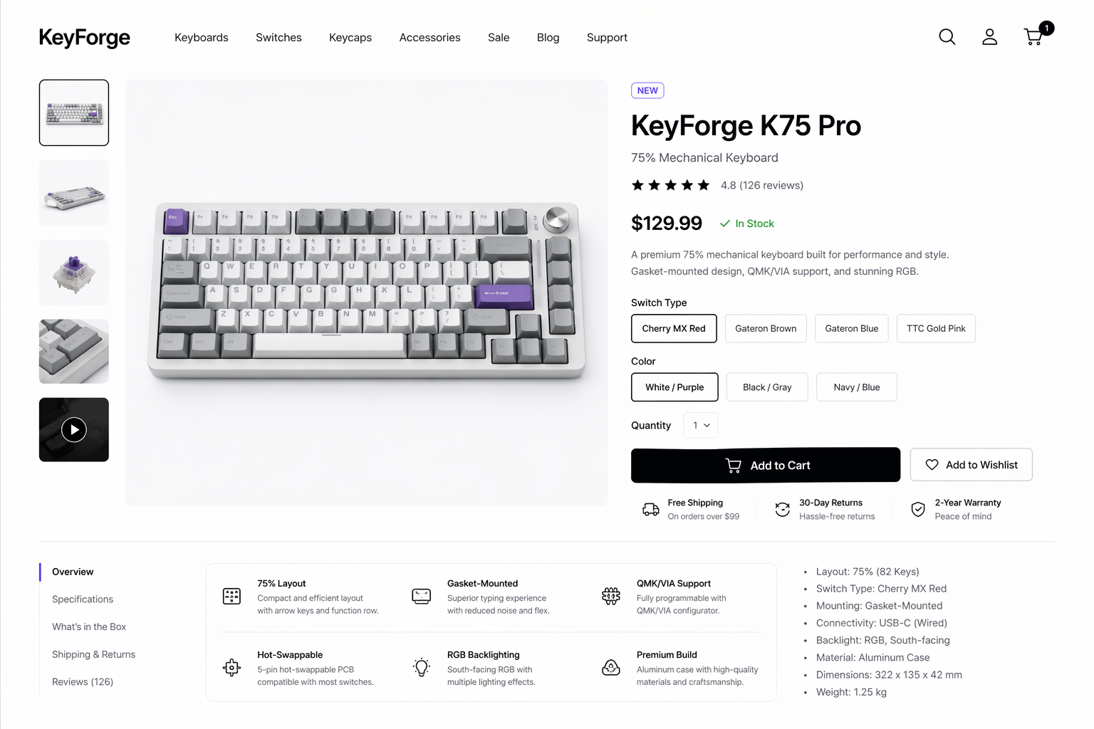
Prompt:
Clean modern e-commerce product detail page for a mechanical keyboard, white background, all product specs, price, and add-to-cart button text perfectly sharp and professional, elegant layout, premium stylish tech aesthetic
An e-commerce product detail page is another highly valuable practical question.
Because it is not a single-page poster, but a complete commercial page that simultaneously contains:
- A main product image
- Specification information
- A price
- A CTA button
- Branding-oriented layout
This type of image is suitable for use in:
- E-commerce marketing visuals
- Concept drafts for product detail pages
- Brand visual exploration
- Product showcase visuals for independent websites
If you want to push this direction so that it looks more like a “real commercial order,” I recommend writing the product information more realistically, for example:
Show a realistic product name, switch type, keycap material, layout, price, and a clear Add to Cart button. Keep the page premium, minimal, and conversion-oriented.
This will make the commercial page feel more real.
Case 7: 3D Transformer Architecture Diagram
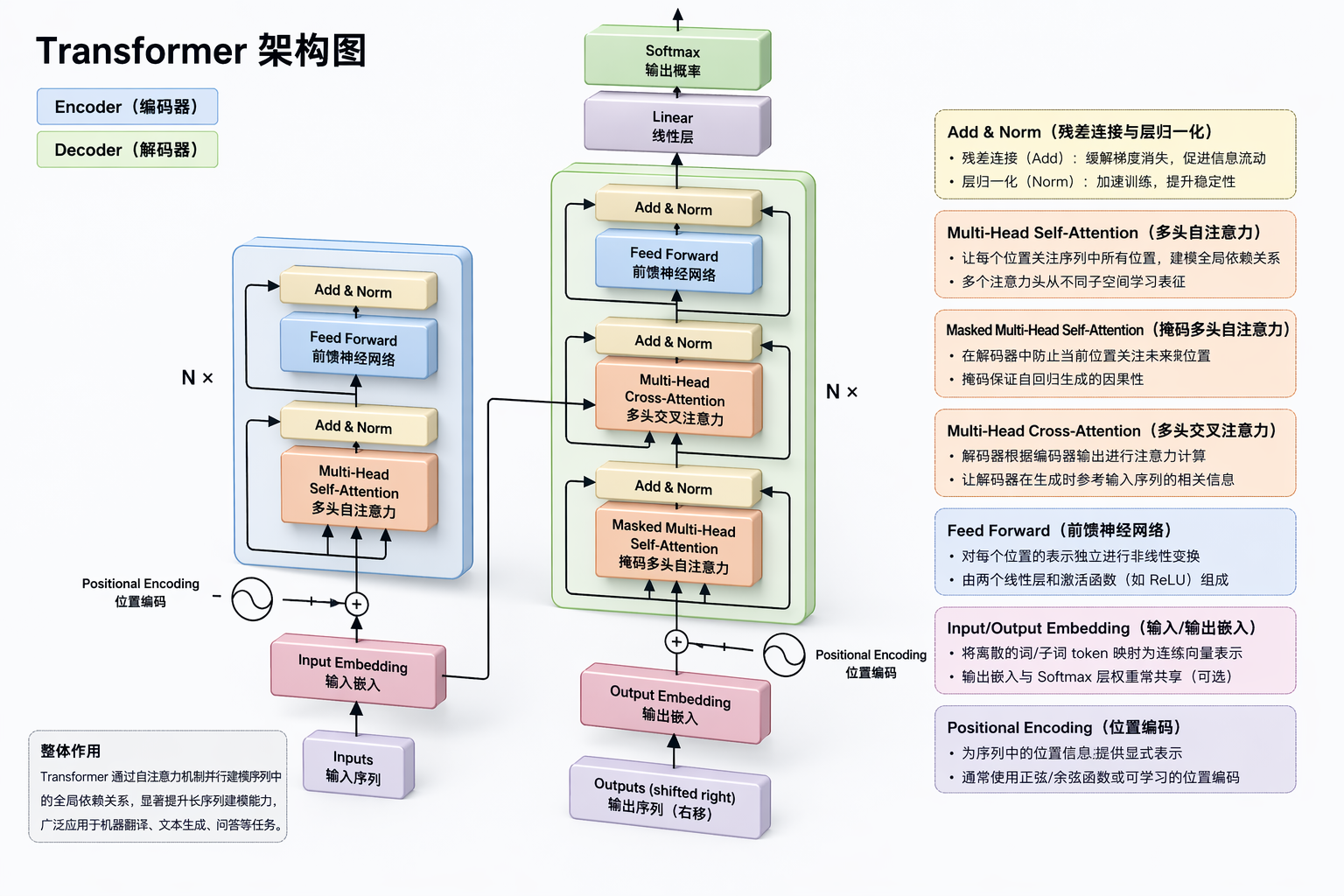
Prompt:
Generate a 3D network structure diagram of the Transformer architecture, and label the functions of the key components in it
This prompt is very short, but the direction is excellent.
What it tests is another kind of high-threshold task: turning an abstract model structure into a diagram that “can explain.”
The difficulty of this kind of image lies in:
- The structural hierarchy must be clear
- The modules cannot just be decorative
- The labels must serve understanding
- It must have both a technical feel and a teaching quality
Suitable scenarios:
- Introductory AI courses
- Articles explaining models
- Presentation visuals
- Content for paid communities or social media image-text posts
However, this case also exposes an important lesson:
For knowledge diagrams, when the prompt is too short, the model can usually produce an image with the “right direction,” but may not necessarily produce one with the “maximum teaching value.”
A more stable way to write it would be:
Create a 3D educational diagram of the Transformer architecture. Clearly label Embedding, Positional Encoding, Multi-Head Attention, Feed Forward, Add & Norm, Encoder, Decoder, and Output. Add short annotations explaining what each component does.
Case 8: High School Math Exam Paper
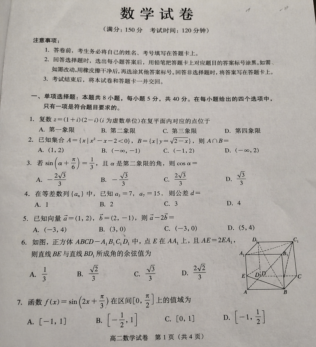
Prompt:
Generate a high school math exam paper with a delicate photographed paper texture
This is also a very clever test question.
Because exam-paper content naturally requires:
- A realistic document layout
- Credible question numbers and formatting
- A dense distribution of a large amount of text
- Natural paper texture
It is highly suitable for testing the model’s ability in “document realism,” rather than just image aesthetics.
Uses for this type of image include:
- Educational content visuals
- Promotional visuals for exam-prep products
- Teaching posters
- Demonstrations of AI-generated study material capability
If you want it to look more like a real exam paper in the next round, you can add the following constraints:
Use a realistic Chinese high school math exam layout with title, student info line, multiple choice section, fill-in section, and detailed solution-style typography. Keep the page photographed from above on a desk.
Case 9: Bilibili Creator “影视飓风” Homepage
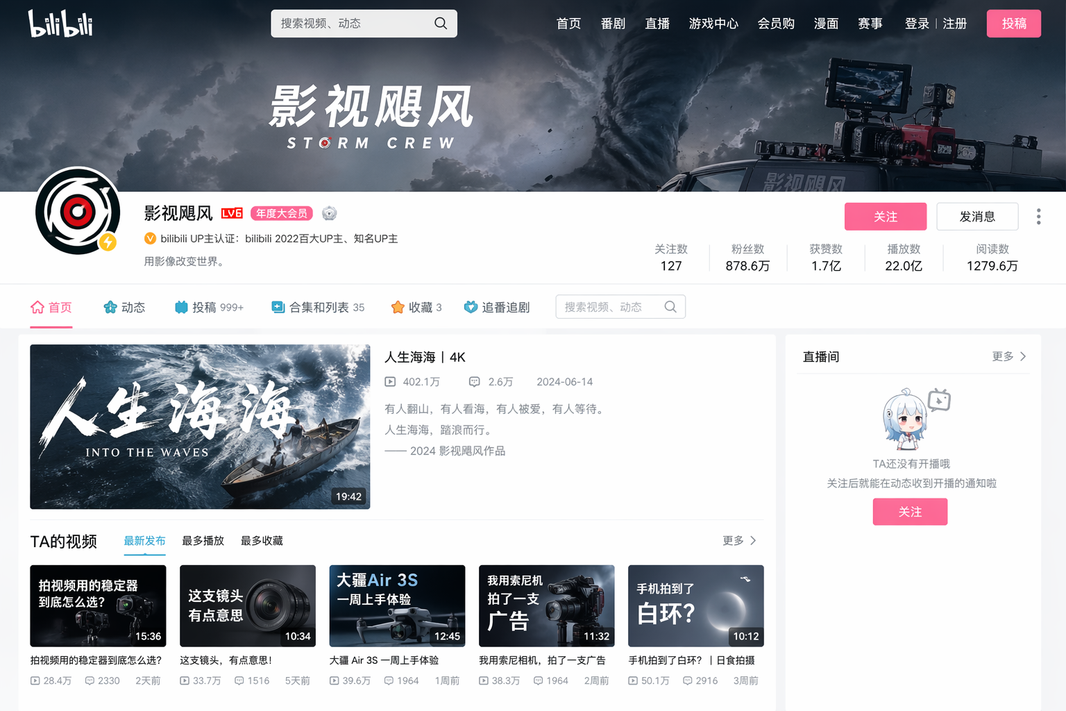
Prompt:
Generate an image of the homepage of the Bilibili creator "影视飓风"
What this case is essentially testing is “platform screenshot realism.”
It has two difficulties:
- It needs to look like the very specific platform interface of a Bilibili homepage
- It also needs to retain the recognizability of a certain well-known creator homepage
This type of image is very suitable for:
- Research into platform screenshot styles
- Visuals for media-related tutorial content
- Visual imitation tests for social media/video platforms
But here we should also pay attention to one lesson:
For this kind of task involving “a specified real platform + a specified real creator homepage,” if the prompt is too short, the model can easily achieve only a “similar atmosphere,” but may not achieve a high level of structural fidelity.
If you care more about page detail, you should add:
Create a realistic Bilibili creator homepage screenshot style image with banner, avatar, video grid, stats, navigation tabs, and recognizable filmmaking-tech aesthetics. Keep all UI text sharp and platform-like.
Case 10: Classical Chinese Explanation of Song Dongyang Ma Sheng Xu
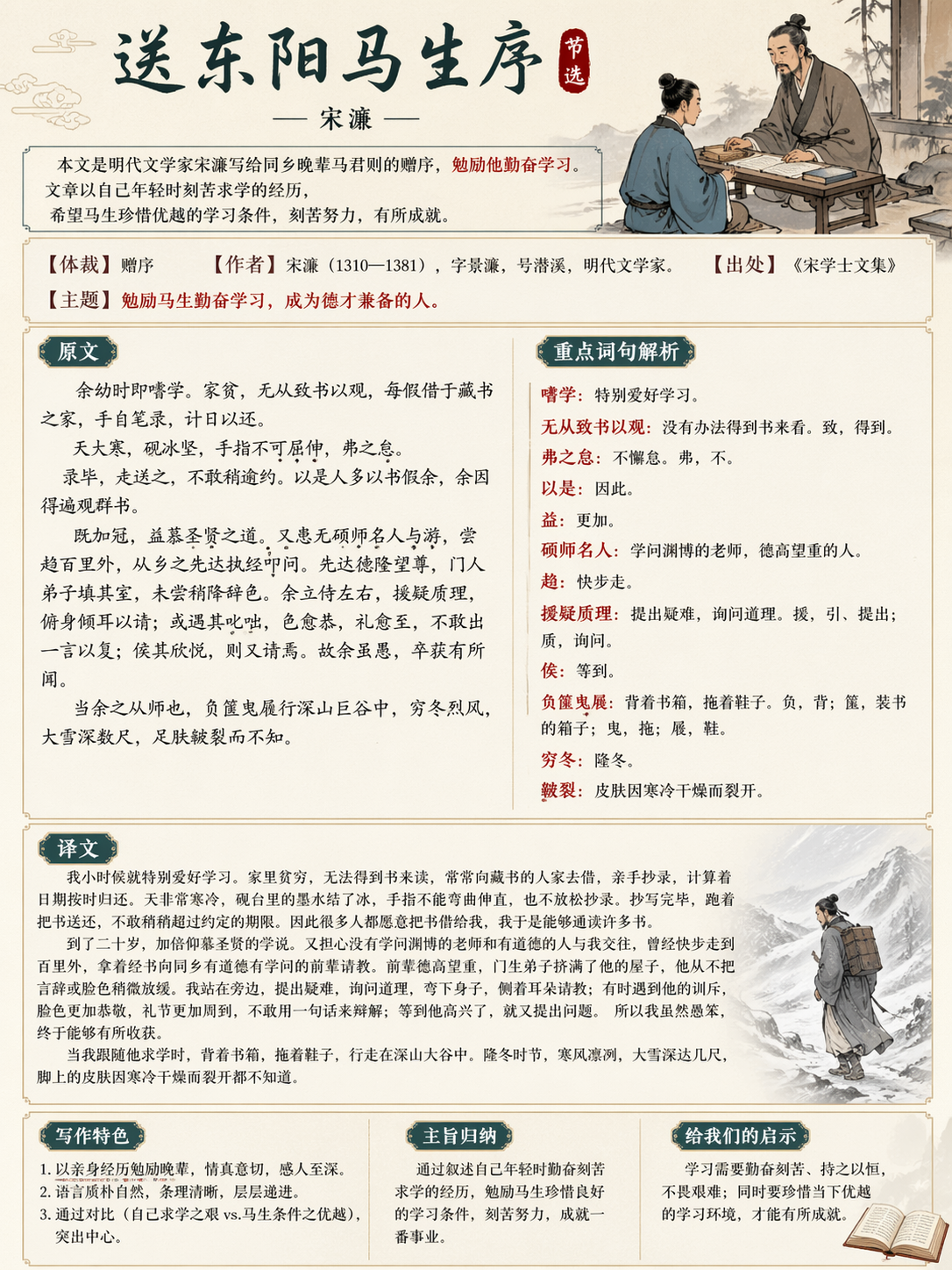
Prompt:
Generate a classical Chinese explanation image: *Song Dongyang Ma Sheng Xu*, with classical charm, including the original text, translation, and key explanations.
This is a direction I like very much.
Because it is not simply making a classical-style poster, but combining a “knowledge explanation card” with “classical aesthetics.”
This type of image is very suitable for:
- Chinese language educational content
- Covers for short videos explaining classical Chinese texts
- Study cards
- Visuals for education-focused public accounts
It tests whether the model can simultaneously handle:
- Large blocks of Chinese text
- Column-based or section-based explanations
- Classical visual elements
- A lecture-note feel rather than pure decoration
If you want to further improve the level of completion, you can continue making the structure explicit:
Create a classical Chinese study poster for 《送东阳马生序》. Include four clearly separated sections: title, original text excerpt, modern Chinese translation, and key explanations. Use elegant ancient-style textures and keep the educational layout highly readable.
5 lessons I summarized from these 10 cases
1. Clearly specifying the “finished product type” is more important than vague description
Do not just say “make a very cool image.” Instead, directly say:
- Dashboard
- Flowchart
- Resume
- Blog homepage
- Cheat sheet
- Product detail page
- Architecture diagram
- Exam paper
- Platform homepage
- Explanation card
Once the finished product type is clear, the model can more easily enter the correct structure.
2. The text in the image should be named explicitly
Words like Total Users, Active Projects, Experience, and Skills are much more effective when written out directly than vaguely saying “include some text.”
3. The clearer the layout constraints, the more stable the infographic
Especially for tasks such as flowcharts, cheat sheets, resumes, and classical Chinese explanation images, if you do not clearly write out the zoning method, the model will easily produce something that merely “looks about right,” rather than a finished product that is “actually readable.”
4. Short prompts are good for testing direction, while long prompts are more suitable for narrowing it down
For cases like the Transformer diagram, math exam paper, and Bilibili homepage, short prompts are already enough to test the model’s sense of direction. But if you want to reach a “publishable” level, in the second round it is best to add structural and textual constraints.
5. GPT-IMAGE2 is now already very suitable for creating knowledge-based content
The clearest conclusion from this set of cases is not that “it can draw pretty pictures,” but rather:
It is becoming increasingly suitable for creating:
- Tutorial illustrations
- Educational infographics
- UI concept drafts
- Text-dense visual content
- Document-realism content
For people making tutorial websites, course products, and self-media content, this is far more valuable than simply generating wallpapers.
Finally, here is a template you can reuse directly
If you want to continue expanding your own GPT-IMAGE2 case library, you can directly use the following Chinese template:
Please generate a [type of finished product].

Theme:
[What this image is meant to express]

Content that must be included:
- [Element 1]
- [Element 2]
- [Element 3]

Text that must appear in the image:
- [Text 1]
- [Text 2]
- [Text 3]

Layout requirements:
[For example: top-middle-bottom structure, left-to-right flow, four-column cards, A4 single-page layout]

Style requirements:
[For example: dark SaaS, modern minimalism, classical education, retro terminal, premium e-commerce on white background]

Quality requirements:
- All text is clear, sharp, and readable
- Professional layout
- Clear structure
- Rich details
- No gibberish
- No watermark
If the first image is already 80% correct, then do not rewrite the entire prompt. Instead, continue using a revision sentence like this:
Keep the overall composition unchanged. Only improve typography, fix inaccurate text, refine spacing, and make the layout look more professional.
This is usually more stable than starting over from scratch.
Closing Remarks
These 10 original cases basically cover several of the most worthwhile practical directions for GPT-IMAGE2 at the moment:
- UI design images
- Technical infographics
- Document and resume realism
- E-commerce and content website interfaces
- Educational and knowledge-explanation images
If you are planning to continue writing more GPT-IMAGE2 categories next, I suggest that the next set could focus specifically on one deeper theme, for example:
- Only “educational content generation”
- Only “Chinese text-dense scenarios”
- Only “webpage and app fake screenshots”
- Only “posters and long-form infographics”
That way, the whole tutorial set will be more systematic and also easier to turn into a serialized content series.